
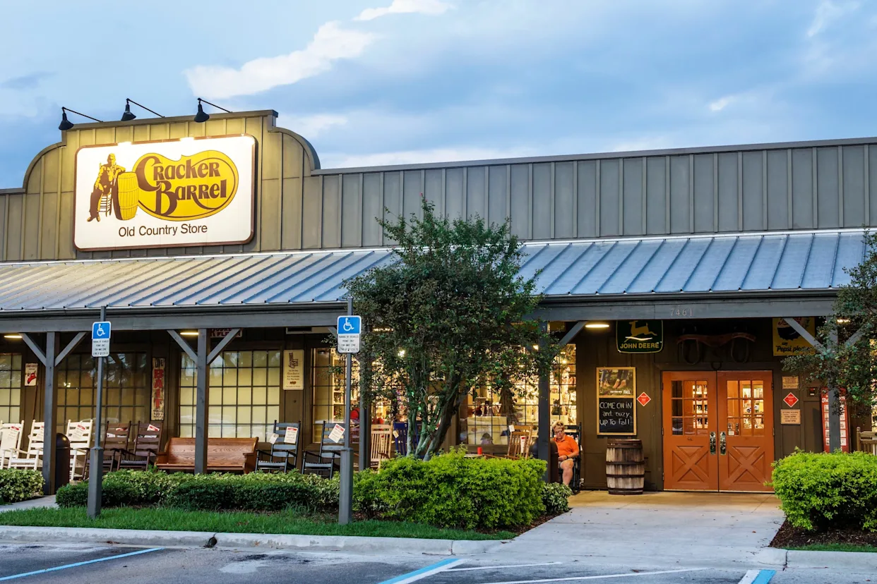
Cracker Barrel has moved to ease concerns from loyal customers after unveiling a refreshed company logo that sparked online criticism. The restaurant chain, known for its traditional Southern-style dining and roadside appeal, assured the public that its iconic “old timer” imagery will remain part of both its menus and highway signage.
The controversy began after Cracker Barrel introduced a streamlined version of its logo as part of a brand update. While the company described the redesign as a modernization effort, some longtime customers reacted negatively, worried that the new look represented a departure from the chain’s nostalgic roots. Social media posts quickly spread with calls to “keep the old man,” referring to the signature figure that has long appeared sitting beside a barrel in the logo.
In a statement, Cracker Barrel emphasized that the brand update was never intended to erase its history. “Our heritage is at the heart of who we are. The ‘old timer’ remains on our menus, our signs, and in our restaurants. He’s part of our story, and he’s not going anywhere,” the company said.
Marketing analysts suggest that the pushback reflects the emotional connection customers have with Cracker Barrel’s branding, which leans heavily on themes of tradition, comfort, and Americana. While companies often refresh their logos to appeal to new generations of diners, they also risk alienating longtime fans who associate familiar imagery with the dining experience itself.
Cracker Barrel’s decision to clarify the role of the “old timer” appears aimed at striking a balance between modernizing its brand identity and preserving the elements that make it recognizable. For customers, the reassurance signals that while the design may evolve, the chain intends to maintain the sense of nostalgia that has defined it for decades.